Colour Theory in Lighting Design: Master Mood and Atmosphere in 2025

“The right colour of light can transform a room from a mere space to an experience.”
1. The Basics of Colour Theory in Lighting Design
Colour theory might sound like something you’d only encounter in an art class, but it’s just as crucial in lighting design. At its core, it’s about understanding how colors interact and how they affect the spaces we live in. When it comes to lighting, colour can shape not just how a room looks but how it feels.
The color wheel is your best friend in lighting design. It’s divided into warm colors (reds, oranges, yellows) and cool colours (blues, greens, purples).
Warm colours tend to evoke energy, comfort, and intimacy, making them great for living rooms and dining areas.
Cool colors, on the other hand, create a sense of calm and focus, ideal for offices and bathrooms.
Then there’s the concept of complementary and analogous colors.
Complementary colors are opposites on the wheel, like blue and orange. Pairing these in lighting—say, a soft amber glow with a subtle blue accent—can create dynamic contrast.
Analogous colors, like blue, green, and teal, offer a harmonious, unified vibe.
Understanding these basics gives you the tools to play with light in ways that enhance your space, creating moods and atmospheres that go beyond function.
2. The Psychology of Colour theory in Lighting Design
Colour has a profound impact on how we think, feel, and behave, and lighting is one of the easiest ways to harness that power. The psychology of colour in lighting design helps explain why certain hues make us feel energized while others help us relax. Knowing this can be a game-changer in how you design your spaces.
Take red lighting, for example. It’s bold, dramatic, and often associated with passion and intensity. I once added a red accent light to a corner of my dining room, and it instantly created a sense of warmth and intimacy during dinner parties. But too much red can feel overwhelming, so it’s best used in moderation.
On the other end of the spectrum, blue lighting has a calming effect. It’s often used in spas and meditation spaces to evoke tranquility. I used a soft blue LED in my bedroom, and it’s now my favorite spot to unwind after a long day.
Green lighting is associated with balance and renewal, making it a great choice for areas where you want to feel grounded, like a home office or reading nook.
Meanwhile, yellow and orange tones bring energy and happiness. These are fantastic for kitchens or living rooms where you want to encourage interaction and warmth.
The key is to match the psychology of the color with the purpose of the space. By doing this, you’re not just lighting a room—you’re setting the mood and enhancing the experience for anyone who enters it.
3. White Light and Colour Temperature
White light might sound simple, but it’s far more nuanced than most people realize. Understanding colour temperature, measured in Kelvins (K), is crucial for achieving the right atmosphere in your lighting design. I learned this the hard way when I accidentally chose a cool white bulb for a cozy nook—it turned my relaxing space into something that felt sterile and uninviting.
Colour temperature ranges from warm white (around 2700K- 3000K) to cool white (4000K and above).
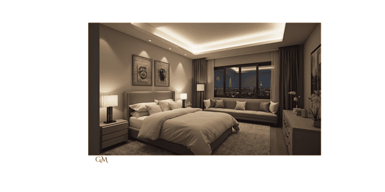
Warm white light mimics the glow of a sunset or candlelight, making it perfect for bedrooms, living rooms, and dining areas. It creates a welcoming and soothing ambiance that encourages relaxation.
Cool white light, on the other hand, is sharper and more energizing. It’s ideal for task-oriented spaces like kitchens, bathrooms, or home offices, where clarity and focus are essential.
Anything above 5000K starts to resemble daylight, which can be great for productivity but might feel too harsh in areas meant for comfort. I personally don’t think you should ever use 5000K and above in a Home.
Then there’s neutral white (around 3500K-4000K), which strikes a balance between warm and cool. I’ve used this in hallways and entryways where you want a versatile, neutral vibe.
When designing with white light, think about layering. Use warmer tones for ambient lighting, neutral tones for accent lighting, and cooler tones for task lighting. This creates a harmonious and functional space where light enhances every activity.
4. RGB Lighting: Unlocking the Full Color Spectrum
RGB lighting is a game-changer in modern lighting design, giving you the ability to unlock the full color spectrum with just a few clicks. RGB stands for Red, Green, and Blue, the primary colors of light. By combining these in different intensities, you can create almost any color you can imagine.
What makes RGB lighting so exciting is its flexibility. Want a vibrant purple for a party? No problem. Need a soft amber to wind down? Easy. Using Colour theory in lighting design is made easy with RGB products.
I installed RGB LED strips under my kitchen cabinets, and now I can shift the entire mood of the room depending on the occasion.
The beauty of RGB lighting isn’t just the colors—it’s the dynamic effects. Many systems let you create fading, pulsing, or even color-changing patterns. I once set up a gradient effect behind my TV that transitioned slowly from blue to green. It added depth to the room and was surprisingly calming.
When using RGB lighting, it’s important to be intentional. Too many colors at once can feel chaotic. I recommend sticking to one or two shades that complement your room’s décor and using colour theory in lighting design.
Also, consider how the light will interact with the materials and colors in the space—some hues may look different when reflected off walls or furniture.
5. Creating Atmosphere with Monochromatic Colour Schemes
A monochromatic colour scheme might sound simple—after all, it’s just one color—but when used as colour theory in lighting design, it can create depth, mood, and a sophisticated aesthetic. This approach focuses on varying shades, tints, and tones of a single hue to create a cohesive atmosphere that feels intentional and balanced.
For instance, I once used a monochromatic blue scheme in a reading nook. By layering a deep navy wall color with soft blue LED lighting and lighter blue cushions, the space felt calm and serene. The trick was mixing light intensities and finishes to add dimension, so the room didn’t feel flat.
Warm colors like reds and oranges in a monochromatic palette can create cozy and intimate spaces, perfect for bedrooms or dining areas.
Cool colors like greens and purples are great for areas where you want to promote relaxation or focus, such as bathrooms or offices.
To avoid monotony, incorporate texture and variation. For example, use different materials—frosted glass fixtures, metallic accents, or textured fabric shades—to play with how light interacts with the color. Dimmer switches are also invaluable here, allowing you to adjust brightness levels and enhance the mood.
6. Complementary Colour Theory in Lighting Design
Complementary colors—those directly opposite each other on the color wheel—are a powerful tool for creating striking contrast and energy in lighting design. Pairings like blue and orange, red and green, or purple and yellow can make a room feel vibrant and dynamic.
Complementary lighting works well in social spaces like living rooms or dining areas, where you want to encourage conversation and interaction. However, moderation is key. Overusing complementary colors can feel overwhelming, so it’s best to use one as the dominant hue and the other as an accent.
If you’re new to this approach, start small—try adding complementary pops of color through table lamps, sconces, or LED strips. Using colour theory in lighting design can pay of if done well. For example, a green lamp shade paired with soft red uplighting can create a subtle but impactful look. The result is a space that feels bold, intentional, and full of personality.
7. Analogous Colour Schemes for Harmony and Flow
Analogous color schemes use three colors that sit next to each other on the color wheel, such as blue, green, and teal or red, orange, and yellow. This approach is perfect for creating a sense of harmony and flow, making it ideal for spaces where you want a cohesive, soothing vibe.
I once used an analogous scheme in my bedroom with a combination of soft lavender, muted blue, and teal lighting. By layering a lavender bedside lamp with blue accent lighting along the ceiling and a teal nightlight, the space felt relaxing and cohesive without being monotonous.
Analogous schemes work especially well in spaces where you want a sense of unity, like open-plan living areas or hallways. The gradual transition between colors helps guide the eye, creating a natural rhythm throughout the space.
When using this approach, vary the intensity and placement of your colors. For example, make one color the dominant tone and use the other two as accents. In my bedroom design, lavender was the main color, while blue and teal were used sparingly to add depth.
Analogous schemes are incredibly versatile and forgiving, allowing you to play with colors while maintaining a harmonious, sophisticated look. A great example of colour theory in lighting design used practically to enhance your space.
8. Accent Lighting and Colour Pops – Colour theory in Lighting Design in Practise
Accent lighting is where color truly comes to life. By focusing light on specific areas or objects, you can introduce pops of color that enhance the mood and aesthetic of a space. Whether it’s a vibrant hue to draw attention to artwork or a soft glow to highlight architectural details, accent lighting is a powerful tool.
To use accent lighting effectively, think about what you want to highlight. It could be a bookshelf, a textured wall, or even a houseplant.
Choose a color that contrasts with the surrounding décor to make the feature stand out. For instance, a golden yellow spotlight on a dark green plant creates a stunning visual effect.
Dimmer switches and smart lighting controls are game-changers for accent lighting. They allow you to adjust the intensity of the color pop, so it can shift from bold and dramatic to subtle and atmospheric depending on the occasion.
Accent lighting with color pops is all about experimentation. Try different placements and hues to find the perfect balance that complements your overall design while adding that extra wow factor.
9. Seasonal and Time-Based Colour Changes
One of the most dynamic ways to use colour theory in lighting design in your home is by incorporating seasonal and time-based changes. Lighting that evolves with the seasons or times of day adds a sense of rhythm and freshness to your space. I’ve used this technique in my own living room, and it keeps the atmosphere feeling both lively and intentional.
In spring and summer, lighter, cooler hues like pastels, greens, and soft blues can mimic the vibrancy of nature. I once used a combination of mint green and sky blue lighting to brighten my space during the warmer months—it felt like bringing the outdoors in.
For fall and winter, warmer tones like amber, deep reds, and golden yellows can make a room feel cozier and more inviting. I especially love using warm white and golden lighting during the holiday season to create that festive glow.
Time-based changes can be just as impactful. Smart lighting systems make it easy to shift colours throughout the day. For instance, soft blues in the morning can energize you, while warm oranges in the evening promote relaxation. I set up my dining room lights to gradually dim to a warm amber after dinner, and it’s become a favorite part of my nighttime routine.
Seasonal and time-based lighting isn’t just functional—it adds an element of storytelling to your home, keeping it in tune with nature and your daily life.
10. Colour Rendering Index (CRI) and Its Importance
The Color Rendering Index (CRI) might not be the most glamorous topic in lighting design, but it’s crucial when working with coloured lighting. CRI measures how accurately a light source reveals the true colors of objects compared to natural light. It’s rated on a scale from 0 to 100, with higher numbers indicating better color accuracy.
Here’s why it matters when using colour theory in lighting design: Even the most carefully selected colors in your décor can look dull or distorted under low-CRI lighting.
I once chose a beautiful teal wall paint for my living room, but under a low-CRI bulb, it appeared muted and lifeless. Swapping to a higher-CRI light made all the difference, bringing out the richness of the color.
When working with colored lighting, aim for a CRI of 80 or above. For spaces where color accuracy is essential—like art studios or makeup areas—opt for bulbs with a CRI of 90 or higher. This ensures that colors appear vibrant and true to life.
Keep in mind that some colored LED lights may have lower CRI scores, which can affect the overall aesthetic of your space. Test your lighting with your chosen color scheme before committing to ensure everything looks just right.
Understanding CRI helps you create lighting designs that truly highlight the beauty of your colors and make your space look its best.
11. Coloured Lighting in Different Room Types
Coloured lighting isn’t a one-size-fits-all solution—how you use it depends on the function and feel of the room. Tailoring your lighting choices to the specific purpose of each space ensures that the colors enhance, rather than overwhelm, your design.
In living rooms, subtle coloured lighting works best for setting the mood. Think soft amber or warm pink accents to create a cozy and inviting atmosphere. I installed RGB LEDs behind my TV, and the ability to shift colors for movie nights or parties has been a hit with guests.
Kitchens benefit from cooler tones like blue or green, which can make the space feel fresh and clean. However, these should be used sparingly, as task lighting (e.g., bright white) still needs to be the primary focus for practicality.
For bedrooms, calming hues like lavender or soft blue promote relaxation and better sleep. I added a dimmable purple LED strip along the underside of my bed frame, and it gives the room a dreamy glow at night.
In bathrooms, colored lighting can add a spa-like feel. A touch of teal or sea green behind a mirror or in a shower niche creates a serene, luxurious vibe. Just be sure to pair it with adequate task lighting for grooming purposes.
By considering the purpose of each room, you can use colored lighting to enhance functionality while creating a unique and tailored atmosphere.
But also remember there are no hard and fast rules, these are guidelines to help you fine-tune your own colour theory in lighting design of your home
Conclusion
Color theory in lighting design is more than just a technical aspect—it’s an art form that can transform any space into a dynamic, personalized environment. By understanding the basics of color theory, exploring advanced techniques, and leveraging tools and technologies, you can create lighting designs that evoke mood, enhance aesthetics, and even improve well-being.
Whether you’re experimenting with RGB systems, tailoring lighting schemes to different rooms, or trying your hand at DIY projects, colored lighting offers endless possibilities for creativity. By incorporating sustainable practices and leveraging modern tools, you can enjoy stunning designs that are both eco-friendly and functional.
Lighting isn’t just about illuminating a room—it’s about crafting an experience. With the insights and ideas in this guide, you’re equipped to harness the power of color and light to make your space truly unforgettable by using colour theory in lighting design in your space.


